Writing capacity or performance reports can take a lot of time and effort. I’ve collected the data, analysed it, forecasted it, written about it, and finally emailed my 50 page document to everyone who might be interested. But is anyone going to be interested enough to open the file and read it? If they do, will they get beyond the management summary on page 2? And if anyone does make it to page 50, who is going to actually understand all of it?
Recently we’ve been setting up monthly capacity reporting for a major investment bank. I thought it might be helpful to share some of the principles and the techniques we’ve found useful as we’ve moved away from the 50-page-document style of reporting to something that is more relevant for all stakeholders.
Automate data collection and analysis
You can skip this step if you want, but this is an important part of making the reporting as relevant and up to date as possible, and saving you a lot of effort in the process. We started by building a set of Excel macros to pull all the data from the relevant sources into an Excel workbook where we had set up formulas for alerting, forecasting, etc. Then as the reports got more complicated we migrated them onto a MS SQL database with a set of services to do the collation and analysis.
Group things together
Once you’ve got all your metrics collected, there are going to be obvious ways to group them together. At the infrastructure level, the metrics that describe a particular server obviously go together, then the servers and network that support a particular service or application go together. At a higher level maybe you have a group of queuing/throughput/response time metrics which describe a particular system component or subsystem. The important thing is to group metrics in a way that makes sense the people who are going to use your report.
Give everything a colour
This is part of the analysis stage – give everything a colour to indicate its importance, based on some type of alerting system. We used the typical RAG status colouring but made it RAGB by including blue, to indicate something that was very low, underutilisation of resources being a potential problem. Once each metric has an alert colour associated with it, you can roll these up into their categories, with bad colours taking priority over good ones. For instance
- if web server 1 memory is red
- web server 1 as a whole becomes red
- the web farm which contains that server becomes red
- and the application that uses it becomes red
One thing we found necessary was for each metric to have multiple colours; for example, one for the current state, one for the forecast state and one for the amount of change seen over the past month. These could then be combined as necessary and resulted in the report having different ‘modes’ depending on whether the user was interested in the past, the future, or both.
Make interactive diagrams
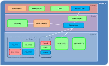
Now that we have our groups and our colours, the key thing is to show them in a way that makes sense to the report users. We did this by putting together a simple diagram for each application, following discussion with the application owners. Each diagram was structured based on ITIL capacity management, with a layer for each of business, service, and component. A basic example is shown in the image below
This diagram immediately shows whether there are any issues with System A, and highlights where they are. If all the shapes are green, no-one needs to look any further! The diagram can easily be created in Excel (with some macro code to colour the shapes based on alerts), or built into a web application – we used raphaeljs javascript vector drawing to generate it dynamically and make it fully interactive.
And here is where the interactive and drilldown elements come into play – if you want to see what is causing UI availability to go Amber, you can simply click on it to see the elements which make up that group. This could be another lower level diagram, or we simply used a list of KPIs with their peak values, again coloured appropriately. These in turn could be clicked on to see a graph of the actual historical values. Anything that is green can simply be ignored, but the report on these elements is still there and available if anyone wants to refer to it.
Finally
There’s a lot more that could be said on reporting techniques, and ways of automating them. But some of the advantages of using a drilldown scorecard as described here are
- Easy to see where any issues have been identified, and go straight to the relevant information
- Different audiences can decide for themselves how much they want to see, and what is relevant to them
- No more copying and pasting charts into 50 page reports!
Of course, if someone really wants that 50 page report to still keep arriving in their inbox you can make an automatic export function to create a pdf or powerpoint perhaps, but that’s another story…

